
Welcome to The Nest Components. Here you’ll find a library of reusable components to help you build pages, along with a quick overview of basic usage and utilities.
Navigate component types using the links on the right. Below are instructions for implementing layout tools like dividers, animations, and advanced classes.
Our reusable components are built using a combination of foundational utility classes.
py-, px-, and pt- classes.⚠️ Note: This section is intended for advanced use (building complex pages and modifying component structures). If you’re ever unsure about an implementation, just reach out to us via email.
These are the most common class utilities you’ll encounter when building your own page using these components, and it’s important to understand each to ensure your site looks uniform, and performs reliably.
The various ingredients and properties that come together to form the building blocks of your sites (components) are built using a combination of classes.
For example, vertical and horizontal padding is handled by the py- px- and pt- classes.
These are the most common class utilities you’ll encounter when building your own page using these components, and it’s important to understand each to ensure your site looks uniform, and performs reliably.
These are the most common class utilities you’ll encounter when building your own page using these components, and it’s important to understand each to ensure your site looks uniform, and performs reliably.
These are the most common class utilities you’ll encounter when building your own page using these components, and it’s important to understand each to ensure your site looks uniform, and performs reliably.
These are the most common class utilities you’ll encounter when building your own page using these components, and it’s important to understand each to ensure your site looks uniform, and performs reliably.
These are the most common class utilities you’ll encounter when building your own page using these components, and it’s important to understand each to ensure your site looks uniform, and performs reliably.

The Nest has been built around a more personal, flexible and child-led approach to care. Rather than rigid structures or one-size-fits-all routines, each child’s experience is shaped around their needs, interests and development.
It’s a setting designed to feel calm, considered and genuinely supportive — for both children and their families.
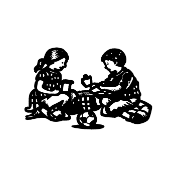
The Nest has been built around a more personal, flexible and child-led approach to care. Rather than rigid structures or one-size-fits-all routines, each child’s experience is shaped around their needs, interests and development.
It’s a setting designed to feel calm, considered and genuinely supportive — for both children and their families.